Posts tonen met het label colourstock. Alle posts tonen

vrijdag 10 maart 2017

1, 2, 3 Jump


Hello everyone, this will be the last time I will have a blog post for Colourstock. This goes further on last times Copic Maker tutorial (click here how you can color a bunny in different ways). Today I also use a rabbit, but explain something else. I want to show you how you can mimic a movement.                * Hallo iedereen, di al mijn laatste blogpost zijn voor Colourstock. Vorige keer toonde ik je hoe je een konijntje op verschillende manieren kon inkleuren met Copic Markers (klik hier om die blogpost te zien). Vandaag ga ik terug met een konijn aan de slag, maar om iets anders uit te leggen. Ik wil jullie tonen hoe je een beweging kan nabootsen.


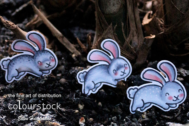
1. First, you'll need a stamp which just makes a move for example an animal that jumps (as here), a man on a skate board/bike, someone who runs,... Stamp your chosen stamp on a white sheet and two times on a fully-adhesive post it. Then you cut out both images.                * 1. Allereerst heb je een stempel nodig die net een beweging maakt bv. een dier dat springt (zoals hier), een mens op een skatebord/fiets, iemand die loopt,... Stempel je gekozen stempel op een wit blad en twee keer op een volledig-klevende post it. Vervolgens knip je beide afdrukken uit.

2. Use the paper that you will use for sure on your card. Place the figure from the post it on the paper. This post it will be replaced at the end with a bunny on 3D foam. Place your stamp a little offside the post it (it will look like the 'movement'). If you want this to be stamped lighter, stamp your bunny first on a scrap sheet and don't re-ink when stamping on the card base (= "secondary stampin").                * 2. Neem opnieuw een papier dat je effectief gaat gebruiken voor je kaartje. Kleef één geknipte post it op het papier. Deze post it ga je nadien vervangen door een afdruk dat je met 3D foam erop kleeft. hieronder stempelen we als het ware de 'bewegingen'. Ik plaats mijn stempel een klein beetje onder de post it uit en stempel het. Als je wil dat deze afdruk lichter is dan je hoofdafdruk dan stempel je eerst op een kladblad en inkt niet bij als je het op je blaadje stempelt dit noemt ook "secondary stampin".

3. Then glue the second post it on the image you just stamped and stamp again your image a little further.                * 3. Vervolgens kleef je de tweede post it op de gestempelde afdruk van daarnet en stempel je afbeelding nogmaals een beetje verder.


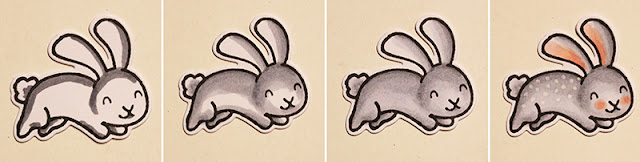
Now we have finally arrived at the coloring. If you start with color choose some marker were you have different colors gradations in. This is important because your movements will be from light to dark colors. So the last stamp really will stand out.                * Nu zijn we eindelijk aan het inkleuren beland. Als je start met kleuren kies dan kleur waarvan je veel gradaties stiften hebt. Dit is belangrijk, omdat je de bewegingen van licht naar donker zal kleuren. Zo zal je laatste stempel afdruk er echt uitspringen.


1. Use the lightest color for the bottom layer. I color the lower edges of the rabbit with W1 and then I use W0 and for the ears R20 and RV10.                * 1. Gebruik de lichtste kleuren voor de onderste laag. Ik kleur de onderste randen van het konijn donkerder met W1 en vervolgens gebruik ik W0 en voor de oren R20 en RV10. 

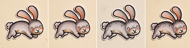
2. Then I used darker colors. Also here you can see the bottom of the legs, face and top of the poop has darker colors. Here I used the Copic Markers W5, W3, RV02 and R20.                * 2. Daarna gebruik ik iets donkerdere kleuren. ook hier zie je dat ik de onderkant van de benen, het gezicht en de bovenkant van de poep donkerder kleur. Hier gebruik ik de Copic Markers W5, W3, RV02 en R20.
 
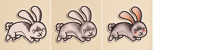
3. Then I color my rabbit, it's on the same way as I explained in one of my previous post (click here for full post). I now colored the back, upper legs and underside of head dark with W7. I mixed my dark edges lighter color W5 and W3. Next, I colored dots on the back of the rabbit by the use of the Marker "0". The ears where colored with R22 and RV21.                * 3. Vervolgens kleur ik mijn konijn in zoals ik uitlegde in een van mijn vorige posten (klik hier voor de volledige post). Ik kleurde nu de rug, bovenkant van de benen en onderkant van het hoofd donker met W7. met draaibewegingen mengde ik die donkeren randen mij lichtere kleur W5 en W3. Vervolgens kleurde ik stippen op de rug van het konijn door het gebruik van de Marker "0". De oren kleurde ik vervolgens met R22 en RV21.

I want to thank all for the super sweet messages on my blog lately.                * Ik wil jullie allemaal nog bedanken voor de super leuke berichtjes op mijn blog de laatste tijd!

http://www.newtonsnookdesigns.com/hoppy-days/
http://www.simonsaysstampblog.com/wednesdaychallenge/simon-says-feminine/

maandag 27 februari 2017

3 Ways to Color a Critter


Hello everyone and more specifically today, hello Copic Lovers between us. Here I am again with a post for Colourstock. In this post I show how I color the same rabbit with different techniques. I like to use simple stamps to show the techniques, so they don't look too overwhelming. These are really easy to apply. You will see that if you're using three different techniques, the animals also look quite different.               * Hallo iedereen en meer specifiek voor vandaag, hallo Copic Lovers tussen ons. Hier  ben ik weer met een post voor Colourstock. In deze post toon ik graag hoe ik hetzelfde konijntje anders inkleur. Ik gebruik graag simpele stempels om de technieken die ik jullie wil bijbrengen niet te overweldigend te doen tonen. Vaak zijn de manieren echt gemakkelijk toe te passen. Je zal zien dat als je de drie verschillende technieken gebruikt, de diertjes er ook helemaal anders uit zien.


The first technique is the most simple. The bunny was colored in the normal way. This means from dark to light and circular movements. The colors I used are C5, C3, C1. To make the animal a little more special, I used Copic Marker "0" and I put dots on the back (this Copic Marker takes the color away). I also colored his cheeks and ears pink with the pins R22, R02 and R20.               * De eerste techniek is de meest simpelste. Het konijntje kleurde ik op de normale manier in. Dit betekend van donker naar licht en met ronddraaiende bewegingen. De kleuren die ik gebruikte zijn C5, C3, C1. Om het diertje toch iets specialer te maken, gebruikte ik Copic Marker "0" en zette ik stippen op de rug (deze Copic Marker neemt de kleur weg). Daarnaast kleurde ik zijn wangen en oren roze met de stiften R22, R02 en R20.


The second technique fits nice between the first and third technique. I colored the base the same way as in the first technique (and also with the same color), but made it look a little different in the fur around the mouth and belly. For the belly and mouth, I use a different color family W (more specific W5, W3 and W0). In addition, I put dots in the dark spots on the back, head and ears. For the dots I go from dark to light (C5, C3 and C1). Make the dots gradually disappear. Personally, I find that this technique not so much different from our previous technique, yet it looks like you have lot more talent in the coloring.               * De tweede techniek zit mooi tussen techniek één en drie die ik hier toon. Ik kleur op dezelfde manier als in de eerste techniek (en ook met dezelfde kleuren), maar ik hou rekening met kleurverschillen in de vacht rond de mond- en buikstreek. Voor de buik en mond gebruik ik een andere kleurfamilie W (namelijk W5, W3 en W0). Daarnaast zet ik stipjes in de donkere plekjes op de rug, hoofd en oren. Ook voor de stippen ga ik van donker naar licht (C5, C3 en C1). Teken steeds minder stippen, zodat de stippen geleidelijk verdwijnen. Persoonlijk vind ik dat deze techniek niet zo veel verschilt van onze vorige techniek, toch lijkt het al snel of je veel meer talent hebt in het kleuren.


The last technique I usually use for more detailed and more realistic stamps, yet it is still possible at a slightly simpler image. I colored here also with C5, C3 and C1, but this time you can see my dark color are on other spots. Think about where you have the shade and where the hairs appear. Usually that is in places where there are folds in the body such as a knee or a nose that's sticking out. In order to show off the the lines / hair better, I go over it again with the same Copic Markers.               * De laatste techniek gebruik ik meestal voor gedetailleerdere en meer realistische stempelafdrukken, toch is het nog mogelijk op een iets simpelere afdruk. Ik kleur hier ook met C5, C3 en C1, maar deze keer zie ik dat ik mijn donkere kleur op andere plekjes teken. Denk na over waar je de schaduw hebt en waar de haartjes te voorschijn komen. Meestal is dat op plekken waar er plooien zijn in het lichaam zoals een knie of het uitsteken van een neus. Om de streepjes/haren nog wat beter te verschijn te laten komen, ga ik er nog eens over met de zelfde Copic Markers.


Now it's your turn to color! What is your favorite technique 1, 2 or 3?               * Nu is het jou beurt om te kleuren! Welke techniek is jou favoriet 1, 2 of 3?

maandag 23 januari 2017

From Start to Finish: Friendschipspinguin


Hello everyone,... Even though the holidays are over, I still have a winter card ready for you made for the Colourstock blog. This week we had little bit snow here, so it is still allowed to make a snow card for Curtain Call lol. Below I will show you step by step how I colored penguin with Copic Markers and write some tips.                * Hallo iedereen,... Ondanks dat de feestdagen voorbij zijn heb ik toch nog een winterkaartje voor jullie klaarstaan gemaakt voor de Colourstock blog. Deze week kregen we nog sneeuw te zien, dus het is nog toegestaan om een sneeuw kaartje te maken voor de Curtain Call wedstrijd blog hihi. Hieronder toon ik stap voor stap hoe ik de pinguïn inkleurde met Copic Markers en schrijf ik enkele tips.


STEP 1: I usually use three color gradations from dark to light to colors in my images. Here I do so too. You can see on each photo how I colored my image. For gray colors I used W5, W3 and W1 and the black 100, C7, C5.               * STAP 1: Meestal gebruik ik drie kleurgradaties van donker naar licht om mijn afbeeldingen in te kleuren. Hier doe ik dat dus ook. Je ziet op elke foto hoe ik de volgende kleur aanbreng. Voor de grijze kleuren gebruikte ik W5, W3 en W1 en voor het zwart: 100, C7, C5.


STEP 2: Here I also use three color gradations such as step one, but with different colors. I used green (G17, G05, YG23), red (R59, R39, R29) and orange (YR07, YR16, Y17). Y17 did not mix so well with the orange color, but there is a little trick. You can touch with Copic Marker point Y17 the tip of marker YR16. This ensures that the lighter marker becomes a little bit darker and therefore better mixing. Do not be afraid, Copic Markers are designed for this purpose and will not destroy your marker. Just remember to scribble with your marker tip on a scrap paper until the ink is gone.               * STAP 2: Hier gebruik ik ook drie kleurengradaties zoals stap één, maar met andere kleuren. Ik gebruikte groen (G17, G05, YG23), rood (R59, R39, R29) en oranje (YR07, YR16, Y17). Y17 mengde niet zo goed met de oranje kleuren, maar daarvoor is een trucje. Met de Copic Marker punt Y17 ging ik even over de punt van stift YR16. Dit zorgt ervoor dat de lichtere stift een beetje kleur opneemt van de donkerdere stift en dan gaat het dus beter mengen. Wees niet bang, deze Copic Markers zijn hiervoor gemaakt en gaan hiervan niet stuk. Vergeet gewoon niet met je stift punt over een kladblaadje te kribbelen tot dat de inkt eraf is.


STEP 3: Again, I do the same, but with other colors. Here you can see the color blue (B29, B18, B16) and gray (C5, C3, C1). As a finishing touch, I went over the edges with Copic Gasenfude Nylon Brush. This ensures that you have no white lines on the sides you have cut paper..               * STAP 3: Ook hier doe ik hetzelfde, maar terug met andere kleuren. Hier zie je de kleuren blauw (B29, B18, B16) en grijs (C5, C3, C1). Als afwerking ging ik ook over de randen met de Copic Gasenfude Nylon Brush. Dit zorgt ervoor dat je geen witte randjes ziet van je gesneden papier, maar mooie zwarte randen.

With the Molotov Liquid Chrome markers (thickness 1mm and 4mm) I put a few dots on the gift and this is the result:                * Met de Molotow Liquid Chrome stiften (punt dikte 1mm en 4mm) zette ik nog enkele stippen op de cadeauverpakking en dan is dit het resultaat:


Hopefully you found it interesting again... I'll see you on Wednesday!               * Hopelijk vonden het weer interessant... Dan zie ik jullie woensdag terug!
https://whimsystamps.com/products/from-a-friend


http://curtaincallchallenge.blogspot.be/2017/01/curtain-call-inspiration-challenge.html

zondag 15 januari 2017

Give Color To Your Texture Paste


Hello everyone, today I show a small but nice tutorial for Colourstock. Below I show how a "Copic Marker Refill" gives color to your "Texture Paste". Just for clarification Texture Paste is a thick paste, which makes it stands out in relief with the aid of a template on your surface.               * Hallo iedereen, vandaag heb ik een kleine maar leuke tutorial gemaakt voor Colourstock. Hieronder toon ik, hoe je met een "Copic Marker Refill" kleur geeft aan je "Texture Paste". Even ter verduidelijking Texture Paste of structuurpasta is een dikke pasta, waarmee je met behulp van een sjabloon een reliëf aanbrengt op je ondergrond.


1. The most used is the white structure paste. It seemed nice to give it a color. I smeared some paste on my Craft Sheet and dropped six ink droplets fall out of the refill / vial.
Then mix the drops with the jelly with a spatula. The more ink you use the darker the paste is of course.
               * 1. Het meest gebruikt is de witte structuurpasta. Het leek me leuk om dit een kleur te geven. Ik smeerde wat pasta op mijn Craft Sheet, liet hierop 6 druppeltjes inkt uit het refill/flesje vallen. Meng vervolgens de druppels met de gelei met een spatel. Hoe meer inkt van je gebruikt hoe donkerder de pasta wordt natuurlijk.

2. Then I used some white glitter to give the paste a little diva content hihi.               * 2. Daarna gebruikte ik nog wat witte glitter om de structuurpasta nog een beetje diva gehalte te geven hihi.


3. As a final step I was looking for a paper that matched the color of my ink. Then I put the colored paste on it with a template. Now I have a nice background for my next card.               * 3. Als laatste stap zocht ik een papiertje dat paste bij de kleur van mijn inkt. Daarop bracht ik de op gekleurde pasta met een sjabloon aan. Nu heb ik een mooie achtergrond voor een kleurwerk.

This is the final result:               * Dit is het uiteindelijke resultaat:

See you on Monday with the new Newton's Nooks release!!               * Tot maandag met de nieuwe Newton's Nooks release!!

zondag 25 december 2016

Using Inktence Pencils

Hello!! Did you have a awesome Christmas evening? I did, so now it's time to have a relaxing Sunday. Make It Crafty has as well digi's as rubber stamps. That's sometimes very handy for water coloring techniques.                 * Hallo!! Had je een fijne kerst avond? Ik wel, en daarom is het tijd voor een ontspannende zondag. Make It Crafty heeft zowel digitale als rubberen stempels. Dat is soms erg handig voor water kleurtechnieken.

On this card I colored the "Magnolia Flowers" with my new inktence pencils. First I stamped my pretty flower stamp on watercolor paper. The pencils are just like paint. You color just a little bit with these pencils (you don't need a lot to get it vibrant). When you go over it with water, you get this pretty water colored look...                 * Op deze kaart kleurde ik de "Magnolia Flowers" met mijn nieuwe inktence potloden. Eerst stempelde ik de "Magnolia Flowers" stempel op aquarelpapier. De potloden zijn net als verf. Eerste kleur je gewoon een beetje met deze potloden (je hebt niet veel nodig om levendige kleuren te krijgen). Als je erna erover gaat met water, krijg je dit mooie waterverflook...


This was unfortunateley my last post for MIC. I hope you enjoyed it! I really love it. Although I didn't use them on this post the chipboards where something new for me and they are a new addiction for sure! That's something I will use more in the future.                * Dit was helaas mijn laatste post voor MIC. Ik hoop dat je het leuk vond! Ik hield er enorm van. Hoewel ik ze niet gebruikte op deze post, maar de houten versiersels zijn iets nieuws voor mij en is een nieuwe verslaving! Dat neem ik mee in de toekomst.
https://whimsystamps.com/products/new-bold-statements https://whimsystamps.com/products/new-love-is-a-flower http://www.makeitcrafty.com/magnolia-flowers-digi-stamp.html http://www.makeitcrafty.com/magnolia-for-mum-rubber-stamp.html

maandag 19 december 2016

Copic Coloring from Start to Finish


Hello, here I am again with a blog post for Colourstock. Today I like to show step by step how I colored the image above. Are you ready?                * Hallo, hier ben ik weer met een blogpost voor Colourstock. Vandaag toon ik graag stap voor stap hoe ik bovenstaande afbeelding inkleurde. Zijn jullie er klaar voor?


Step 1: I start with the darkest color first; E47 and after that the light areas (belly and thighs) E33. As you can see I put lines on the belly while the other parts are normally colored. | Step 2: Then I use lighter colors. First with E37 and E31. | Step 3: Then we go even lighter with E35 and E21 on the highlights.                * Stap 1: Ik start met de donkerste kleuren eerst; E47 en op de lichte delen (buik en bovenbenen) E33. Zoals je ziet zet ik ook streepjes op de buik terwijl ik op de andere delen lijnen teken.  |  Stap 2: Vervolgens ga ik de kleuren steeds verlichten. Allereerst met E37 en E31.  |  Stap 3:  Daarna gaan we nog lichter met E35 en E21 op de lichtste delen.


Step 4: The deer is colored with E33 in the darkest part. I also colored the yellow bells with YR16, Y17, Y15. In the first layer of the girl I colored with R59 for red, G17 for green, W5 for grey and YR02 for the skin color. | Step 5: Then I always use lighter colors; R39 for red, G05 for green, W3 for gray and pink E02. I always make little circles with my marker point to let the colors flow together nicely. | Step 6: Again, I use lighter colors RV29 for red, YG06 for green, W1 for gray and for pink R00. For the ears and the greens on the deer I used the same colors of the girl.                 * Stap 4: Het hert kleur ik af met E33 in de donkerste deel. Verder kleurde ik de gele belletjes in met YR16, Y17, Y15. In de eerste laag van de het meisje kleurde ik met R59 voor rood, G17 voor groen, W5 voor grijs en met YR02 voor de huidskleur.  |  Stap 5: Vervolgens gebruik ik steeds lichtere kleuren; voor rood met R39, voor groen G05, voor grijs W3 en voor het roze  E02.Steeds draai ik rondjes met mijn stift om de kleuren mooi in elkaar te laten vloeien.  |  Stap 6: Ook hier gebruik ik lichtere kleuren, voor rood RV29, voor groen YG06, voor grijs W1 en roze R00. Let op voor de oren en de groenen band van de het hert gebruikte ik dezelfde kleuren van het meisje.


Step 7: In this step, I only colored just a little bit with red R27 and gray W0 for the clothes of the girl. I also start to color the hair with E37. | Step 8: Now I only have to color the hair with YR23 and E33. I draw with lines here. For the cheeks I used R05 | Step 9: The rest of the hair is colored with Copic Marker Y17 and cheeks with R02.                 * Stap 7: In deze stap kleur ik enkel nog een beetje met  Rood R27 en grijs W0 voor de kleren van het meisje. Verder begin ik de haren in te kleuren met E37.  |  Stap 8: Nu kleur ik enkel nog de haren met E33 en YR23. Ik zet hier duidelijk streepjes. Voor de wangen gebruikte ik R05  |  Stap 9: De haren kleur ik af met Copic Marker Y17 en de wangen met R02.

This is how the card finally looks...                 * Zo ziet het kaartje er uiteindelijk uit...


Thanks for visiting my little blog!                 * Bedankt om op men blogje te komen piepen!


https://www.elsbrige.com/shop/warme-wensen/?v=d3dcf429c679 https://www.elsbrige.com/shop/warme-wensen-coordinerende-stansset/?v=d3dcf429c679

woensdag 23 november 2016

Resist Technique With Copic Markers


Hello creative people. Here I am again made a fun tip made for the Colourstock blog. Below I like to show in three steps how to conjure up a nice pattern on a colored surface by using the "Activator" spray. This technique is also called 'resist technique', because you take away the color.                 * Hallo creatievelingen. Hier ben ik weer met een leuke tip gemaakt voor de Colourstock blog. Hieronder toon ik graag in drie stappen hoe je op een gekleurde vlak een leuk motief kan tevoorschijn toveren door de "Activator" spray te gebruiken. Deze techniek word in het Engels ook wel 'resist technique' genoemd, omdat je de kleur wegneemt.


1. First, you need to make a color your base with Copic Markers. On my background I used: R59, R39, R29 and R27.                 * 1. Allereerst is het de bedoeling dat je je vlak inkleurt met je Copic Markers. Op mijn achtergrond gebruikte ik: R59, R39, R29 en R27.

2. Then you spray with your "Activator" on the stamp with your chosen motif. You can also use the "Copic Cleaner", because it has the same liquid. The spray is, of course, easier to apply.                 * 2. Vervolgens spray je met je "Activator" op een de stempel met je gekozen motief. Je kan hiervoor ook je "Copic Cleaner" gebruiken, want daar zit dezelfde vloeistof in. De spray is natuurlijk wel makkelijker om aan te brengen.


 3. Finally, you stamp your pattern on the colored surface. Keep in mind to not wait too long, because the liquid dries fairly quickly.               * 3. Tot slot stempel je je motief op het gekleurde vlak. Let ook op dat je hiermee niet te lang wacht, want de vloeistof droogt redelijk snel op.

This is how my background looks on a card:               * Zo ziet het de achtergrond eruit op mijn kaartje:

Below you find the other colors that I used on this card:                 * Hieronder vinden jullie nog snel de andere kleuren die ik gebruikte op dit kaartje: Green/Groen: G14, YG23, YG11  |  Yellow/Geel: YR16, Y17, Y08, Y02  |  Red/Rood: R39, R27  |  Orange/Oranje: R27, R05, YR04, Y17  |  Brown/Bruin: E35, E33, 31.

Have fun today and see you next time!:                 * Veel plezier vandaag & tot de volgende!